
TL;DR:
- Mobile SEO focuses on optimizing websites for smartphones and tablets to enhance rankings and user experience. Since Google prioritizes mobile-first indexing, maintaining content parity, fast load speeds, and responsive design is crucial. Regular audits and device-specific performance monitoring are essential for sustained SEO success on mobile platforms.
Mobile SEO is defined as the practice of optimizing websites for smartphones and tablets to rank higher in mobile search results and deliver a fast, frictionless experience to mobile visitors. Since Google adopted mobile-first indexing by default in 2021, the mobile version of your site is the primary basis for how Google indexes and ranks your pages across every device. That single shift changed the rules for every website owner and digital marketer. Tools like Google Search Console and PageSpeed Insights now sit at the center of any serious mobile search engine optimization strategy, giving you the data you need to measure and act.
What is mobile SEO and how does it differ from desktop SEO?
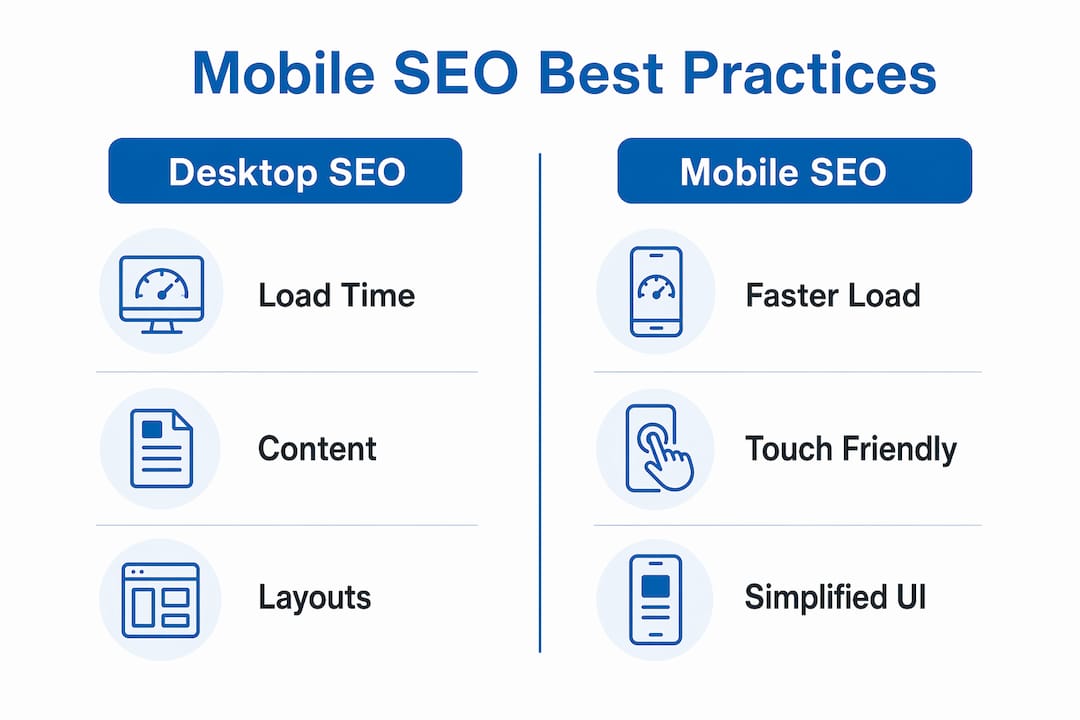
Mobile SEO and desktop SEO share the same goal: rank well in Google and attract qualified visitors. The execution, however, is fundamentally different, and understanding those differences is the first step toward getting your strategy right.

Desktop SEO assumes a large screen, a mouse, a fast broadband connection, and a user who is seated and focused. Mobile SEO accounts for a 6-inch screen, touch navigation, variable network speeds, and a user who may be walking, commuting, or multitasking. Mobile users scroll quickly and spend less time on individual pages, which means your content must be scannable, your buttons must be tap-friendly, and your pages must respond instantly.
The technical constraints are equally significant. Here is where mobile SEO diverges most sharply from its desktop counterpart:
- Screen size and layout. Responsive design is not optional. Content that overflows or requires horizontal scrolling on mobile creates a poor experience and signals poor quality to Google.
- Content parity. Google’s crawler uses a smartphone user agent to index your site. If your mobile version hides content that appears on desktop, that content does not get indexed and cannot rank.
- Load speed. 53% of mobile visits are abandoned when a page takes longer than 3 seconds to load. Desktop users tolerate longer waits; mobile users do not.
- User intent signals. Mobile searches skew toward local, immediate, and voice-driven queries. Desktop searches tend to be more research-oriented and longer in form.
- Resource constraints. Mobile devices have less processing power and memory than desktops, making JavaScript-heavy pages particularly damaging to mobile performance.
The bottom line: mobile SEO is not a scaled-down version of desktop SEO. It is a distinct discipline with its own technical requirements, user behavior patterns, and ranking signals.
Core best practices for mobile SEO implementation
Getting mobile SEO right requires a combination of technical discipline and user experience thinking. The two are inseparable. A technically perfect page that is hard to read on a phone will still underperform.
Here are the foundational practices, ordered by impact:
-
Adopt responsive web design. Responsive design uses a single codebase that adapts to any screen size. It is Google’s preferred approach because it eliminates the risk of content discrepancies between mobile and desktop versions. Platforms like WordPress, Shopify, and Squarespace all support responsive themes natively.
-
Hit Core Web Vitals benchmarks. Google’s Core Web Vitals measure Largest Contentful Paint (LCP), Interaction to Next Paint (INP), and Cumulative Layout Shift (CLS). For mobile, LCP should be under 2.5 seconds. Compress images with tools like Squoosh or ShortPixel, defer non-critical JavaScript, and use lazy loading for below-the-fold content.
-
Configure the viewport correctly. Your HTML must include the meta viewport tag: "`. Without it, mobile browsers render your page at desktop width and then scale it down, breaking the layout.
-
Design for thumbs, not cursors. Buttons and tap targets should be at least 48×48 pixels with adequate spacing between them. Font sizes should be a minimum of 16px for body text to prevent users from needing to pinch and zoom.
-
Eliminate intrusive interstitials. Pop-ups that cover the main content on mobile are a direct ranking signal for Google. Use banners or slide-ins that do not block the primary content.
-
Maintain metadata and structured data parity. Your title tags, meta descriptions, canonical tags, and schema markup must be identical across mobile and desktop. Inconsistencies confuse Google’s crawler and can dilute your ranking signals.
-
Run regular audits. Use Google’s Mobile-Friendly Test to check individual URLs and Google Search Console’s Mobile Usability report to identify site-wide issues. Make this a monthly habit, not a one-time check.
| Element | Desktop standard | Mobile standard |
|---|---|---|
| Page load time | Under 3 seconds | Under 2.5 seconds (LCP) |
| Font size | 14px minimum | 16px minimum |
| Tap targets | N/A | 48×48 pixels minimum |
| Interstitials | Acceptable | Penalized by Google |
| Content visibility | Full content | Must match mobile exactly |
Pro Tip: Run PageSpeed Insights on your three highest-traffic pages right now. The “Mobile” tab will show you your Core Web Vitals field data, which reflects real user experience, not just lab conditions. Fix the issues flagged as “Poor” before anything else.
How mobile-first indexing shapes your SEO strategy
Google’s mobile-first indexing is not a future consideration. It is the current reality, and it has been since 2021. Understanding what it means in practice changes how you approach both site design and content strategy.
Google crawls your site using a smartphone user agent, and the content it finds on the mobile version becomes the primary source for indexing and ranking. Your desktop site is secondary. This has several direct consequences for strategy:
- If your mobile site loads a condensed version of your content to save bandwidth, that condensed version is what Google ranks. The full desktop content is largely invisible to the algorithm.
- Internal links on your mobile version are the links Google follows to discover and index other pages. If your mobile navigation omits links that appear in your desktop footer or sidebar, those pages may not get crawled efficiently.
- Structured data like FAQ schema, product schema, and breadcrumb markup must appear on the mobile version. Structured data that only lives on desktop pages provides no ranking benefit.
- Desktop design should be built as an extension of mobile-first design, not the other way around. Start with the mobile experience and enhance it for larger screens.
The strategic implication is clear: mobile is the baseline, and desktop is the enhancement. Reversing that priority is one of the most common and costly mistakes site owners make.
| Scenario | Impact on rankings |
|---|---|
| Mobile and desktop content match | No ranking penalty; full content indexed |
| Mobile hides content desktop shows | Hidden content not indexed; rankings drop |
| Structured data on desktop only | Schema benefits lost; rich results may not appear |
| Mobile-only internal links missing | Pages may not be crawled or indexed efficiently |
How to measure mobile SEO performance
Measuring mobile SEO success requires segmenting your data by device. Aggregate traffic numbers mask mobile-specific problems. A page with a 40% overall bounce rate might have a 70% mobile bounce rate, which points directly to a mobile UX or speed issue.
SEO audits should include mobile-specific usability and performance measurements using Google Search Console, PageSpeed Insights, and field data to reflect actual mobile user experience. Here is how to build that measurement practice:
- Google Search Console. The Mobile Usability report flags issues like text too small to read, clickable elements too close together, and content wider than the screen. The URL Inspection tool shows you exactly how Google’s smartphone crawler sees a specific page.
- PageSpeed Insights. This tool pulls both lab data and real-world field data from the Chrome User Experience Report (CrUX). The field data is what matters most because it reflects actual mobile users on actual devices and networks.
- Google Analytics 4. Create a segment or exploration report filtered to mobile devices. Track engagement rate, session duration, and conversion rate separately for mobile. Mobile users have lower tolerance for load delays and navigation friction, so behavioral metrics will surface problems that technical audits miss.
- Core Web Vitals monitoring. Use the Core Web Vitals report in Google Search Console to track LCP, INP, and CLS at scale across your entire site, not just individual pages.
The importance of mobile SEO shows up clearly in these metrics. Sites that invest in mobile performance consistently see lower bounce rates, higher engagement, and stronger organic rankings across all devices, not just mobile. Regular monitoring closes the loop between technical fixes and measurable outcomes.
Key takeaways
Mobile SEO requires treating the mobile version of your site as the primary product, not a secondary adaptation, because Google indexes and ranks based on mobile content first.
| Point | Details |
|---|---|
| Mobile-first indexing is the standard | Google has ranked sites based on mobile content since 2021; desktop is secondary. |
| Content parity is non-negotiable | Any content missing from your mobile version is effectively invisible to Google. |
| Speed is a direct ranking factor | Pages that load in over 2.5 seconds fail Core Web Vitals and lose mobile rankings. |
| Measurement must be device-segmented | Aggregate analytics hide mobile-specific problems; always analyze mobile data separately. |
| Responsive design is the foundation | A single responsive codebase eliminates content discrepancies and simplifies SEO maintenance. |
Mobile SEO is not a checkbox. It’s a compass.
I have worked with enough site owners to know the pattern. They build a site, run a quick mobile preview in Chrome’s DevTools, decide it “looks fine,” and move on. Six months later they are wondering why their rankings have plateaued or dropped, and the answer is almost always sitting in their Mobile Usability report in Google Search Console, untouched.
The importance of mobile SEO is not theoretical. It is the mechanism by which Google decides whether your content deserves to rank. Getting it right is not a one-time project. It is an ongoing discipline that requires regular audits, performance monitoring, and a willingness to prioritize the mobile experience even when desktop looks better.
What I find most underappreciated is the compounding effect. Fixing mobile speed improves Core Web Vitals scores. Better scores reduce bounce rates. Lower bounce rates send positive behavioral signals to Google. Those signals reinforce rankings. The whole system rewards the sites that treat mobile as the anchor of their SEO strategy, not an afterthought. Start there, and the rest of your SEO work becomes significantly more effective.
— Big
Ready to get your mobile SEO on course?
If you have read this far, you already understand why mobile SEO matters and what it takes to get it right. The next step is putting that knowledge to work on your own site.

At Bigfinseo, we help website owners and digital marketers chart a course through the technical and strategic side of search optimization. Whether you are just getting started or looking to fix specific mobile performance gaps, our SEO for beginners resource is built for exactly that. You can also explore our guide to mobile optimization techniques for a deeper look at the performance improvements that move the needle. Let’s get your site ranking where it belongs.
FAQ
What is mobile SEO in simple terms?
Mobile SEO is the process of optimizing your website so it ranks well in mobile search results and provides a fast, easy experience for smartphone and tablet users. It includes responsive design, fast load times, and content that matches what Google’s mobile crawler sees.
Is mobile SEO necessary for every website?
Yes. Since Google uses mobile-first indexing for all sites, the mobile version of your content determines your rankings on every device, including desktop. Neglecting mobile SEO harms your overall search visibility regardless of how strong your desktop site is.
How does mobile-first indexing affect my rankings?
Google indexes and ranks your site based primarily on its mobile version. If your mobile site has missing content, slow load times, or broken structured data, those issues lower your rankings across all devices, not just mobile.
What tools should I use to check mobile SEO?
Google Search Console’s Mobile Usability report, PageSpeed Insights, and Google’s Mobile-Friendly Test are the three core tools. Together they cover usability issues, Core Web Vitals performance, and real-world field data from actual mobile users.
How long does it take to see results from mobile SEO improvements?
Technical fixes like viewport configuration and image compression can improve Core Web Vitals scores within days of deployment. Ranking improvements typically follow within four to twelve weeks, depending on how frequently Google recrawls your site and the competitiveness of your target keywords.
Michael Fleischner is the founder of Big Fin SEO, a New Jersey-based local SEO agency helping service-area and multi-location businesses increase visibility, generate qualified leads, and drive measurable revenue from search.
He is a TEDx speaker, Amazon-published author of The 7 Figure Freelancer, and a frequent speaker on SEO, AI-driven marketing, and personal branding.


 Corine R.
 Laura A.