
TL;DR:
- Web design for SEO focuses on structural, technical, and visual decisions that support search engine crawling and ranking. Effective design ensures fast load times, mobile responsiveness, and clear site architecture, which directly influence search performance. Integrating SEO considerations from the start prevents costly fixes and maximizes your website’s ranking potential from day one.
Most business owners think web design is about colors, fonts, and a polished logo. It is not. What is web design for SEO? It is the practice of building a website where every structural, visual, and technical decision either helps or hurts your search rankings. Google does not care how beautiful your site looks. It cares whether it can crawl your pages, load them fast, and determine what they are about. Get those things wrong in the design phase and you will be fixing expensive problems later. Get them right and your site becomes a search engine asset from day one.
Key Takeaways
| Point | Details |
|---|---|
| Design directly affects rankings | Every layout and structural choice you make influences how Google crawls and ranks your pages. |
| Mobile-first is non-negotiable | Google indexes the mobile version of your site first, making responsive design a ranking requirement. |
| Core Web Vitals are measurable | LCP, INP, and CLS scores affect competitiveness; passing thresholds can reduce bounce rates significantly. |
| UX and SEO share the same goals | Logical site hierarchy, semantic headings, and internal linking serve both users and search engines equally. |
| Integrate SEO before design launches | Adding SEO after a site goes live costs more time and money than building it in from the start. |
What web design for SEO actually means
Web design for SEO, sometimes called SEO web development, is the discipline of building websites where design decisions are made with search engine requirements in mind from the very beginning. It is not a post-launch checklist. It is an architectural philosophy.
Search engines like Google send automated programs called crawlers to discover and index your web pages. Those crawlers follow links, read your HTML, and interpret your site structure. If your design buries important pages behind JavaScript that takes too long to render, the crawler may never see that content. If your navigation is disorganized, crawlers may deprioritize deeper pages entirely.
Here is what SEO-friendly web design actually covers:
- Site architecture: How pages are organized, linked, and grouped into logical categories that make sense to both users and search engines
- Content visibility: Placing keyword-rich text in crawlable HTML rather than hiding it inside images or inaccessible scripts
- Semantic HTML structure: Using the correct tags (headings, paragraphs, lists, schema markup) so search engines understand what each page is about
- Navigation clarity: Building menus and internal links that distribute authority across the site and help crawlers reach every important page
- Page performance: Designing for speed from the start, not as an afterthought after a bloated design is already built
The importance of SEO in web design becomes obvious when you realize that a visually stunning site with poor architecture can rank far below a simpler, well-structured competitor. Design choices set the ceiling for what SEO can achieve.
Technical elements of SEO web design
This is where most businesses leave real ranking power on the table. Technical SEO is not separate from design. It is embedded in every pixel and line of code.

Mobile-first design
Google’s mobile-first indexing means the mobile version of your site is what gets crawled and ranked, not the desktop version. Responsive design is strongly recommended because it serves the same HTML to all devices, eliminating canonical conflicts and duplicate content risks. A site that looks great on a desktop but breaks on a phone is actively losing rankings right now.
Core Web Vitals
Google uses three user experience metrics to assess page quality:
- LCP (Largest Contentful Paint): How fast the main content loads. Target under 2.5 seconds.
- INP (Interaction to Next Paint): How quickly the page responds to user input. Target under 200ms.
- CLS (Cumulative Layout Shift): How much the page visually shifts while loading. Target under 0.1.
Passing Core Web Vitals can reduce bounce rates by up to 24% and acts as a tiebreaker when two pages are similarly relevant. These are not abstract developer concerns. They are design constraints that affect your revenue.
Pro Tip: Set performance budgets during the design phase. Automate checks so that builds fail automatically if LCP exceeds 2.5s, CLS exceeds 0.1, or INP exceeds 200ms. This prevents performance regression as your site evolves.
Structured data and schema
Schema markup helps search engines understand your page context and can generate rich results like star ratings, FAQs, and breadcrumbs directly in the search results page. This lifts your click-through rate without changing your ranking position. FAQ schema, product schema, and breadcrumb schema are among the most impactful for business sites.
| Design Element | SEO Impact | Priority |
|---|---|---|
| Responsive design | Prevents duplicate content, supports mobile-first indexing | Critical |
| Core Web Vitals optimization | Reduces bounce rate, improves competitiveness | High |
| Schema markup | Enables rich results, improves CTR | High |
| Image sizing with srcset | Improves LCP scores, reduces load time | Medium |
| Explicit image dimensions | Prevents CLS layout shifts | Medium |
Designers should always define explicit image dimensions in HTML. When a browser does not know an image’s size before it loads, the surrounding content shifts as the image appears. That shift registers as CLS and drags your score down.
UX design practices that power SEO
Good user experience and strong SEO are not separate goals. They are the same goal measured differently.
Search engines increasingly use behavioral signals to assess page quality. Pages with strong user engagement, meaning low bounce rates and longer dwell times, outperform pages with poor layout even when the written content is comparable. User behavior affects rankings, so designing for friction-free experiences is also designing for better search performance.
Here are the UX design principles that deliver the most SEO value:
- Shallow site architecture: Most pages should be reachable within three clicks from the homepage. Deep, buried pages receive fewer internal links and less crawl attention, which suppresses their rankings.
- Semantic heading hierarchy: Use one H1 per page that includes your target keyword. Structure H2s and H3s to organize your content logically, not decoratively. Semantic heading structure aids both crawlability and user comprehension.
- Internal linking: Connect related pages to distribute authority and guide both users and crawlers to your most important content. A strong internal linking strategy dramatically improves how efficiently Google maps your site.
- Accessibility standards: Alt text on images, sufficient color contrast, and keyboard navigability are not optional extras. They make your content available to more users and signal content quality to search engines.
- Clear calls to action: Reducing friction in conversions keeps users on-site longer, which improves the engagement signals that feed into your rankings.
Pro Tip: When auditing your own site, open an incognito window and try to reach your five most important pages by clicking only. If you cannot reach any of them in three clicks, your architecture is hurting both your users and your rankings.
The best sites balance aesthetic design with performance and clear information hierarchy. One without the other leaves money on the table. You can learn more about improving engagement metrics to see how UX changes translate directly into SEO results.
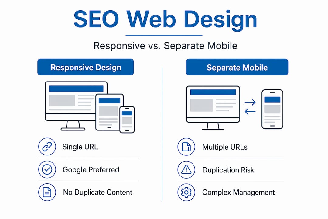
Responsive design vs. other approaches
Choosing how to handle different devices and site configurations is one of the biggest decisions in SEO web development. Getting it wrong creates problems that are expensive to undo.
| Approach | SEO Advantages | SEO Risks |
|---|---|---|
| Responsive design | Single URL, no duplication, preferred by Google | Requires careful performance tuning |
| Separate mobile URLs | Full design control per device | Content gaps, duplicate content, canonical errors |
| Single-page applications (SPAs) | Rich user experience, fast navigation after load | Client-side rendering delays hurt LCP and crawlability |
| Multi-page architecture | Clear indexing signals, simpler crawl path | Can feel slower if poorly optimized |
Separate mobile URLs increase the risk of content gaps and duplicate content issues. If the mobile version of a page is missing content that appears on the desktop version, Google’s mobile-first crawler will index the incomplete version. That directly impacts what you rank for.
Single-page applications present a different challenge. Because they rely on JavaScript to render content in the browser, client-side rendering delays can cause LCP penalties and make it harder for crawlers to discover and index all your content. Server-side rendering or hybrid hydration approaches solve most of these issues, but they require planning from the start.
Responsive images using the srcset attribute serve appropriately sized files to each device. A mobile user does not need to download a 2,400-pixel-wide image. Forcing them to does nothing for their experience and punishes your LCP score. Modern image formats like WebP deliver smaller file sizes with the same or better visual quality compared to JPEG and PNG.
One commonly overlooked pitfall is lazy loading. Lazy loading images below the fold is smart SEO. But applying it to images above the fold causes layout shifts that crush your CLS score. Only lazy load below-fold images and use fixed-size containers with placeholders to prevent unexpected content movement.
My honest take on design and SEO working together
I have worked with enough business owners to know the most common mistake: they hire a designer, approve a beautiful site, and then call an SEO agency after launch to “make it rank.” At that point, the architecture is baked in. Fixing it means rebuilding sections of the site, renegotiating with developers, and losing months of potential ranking momentum. It is the most avoidable problem in digital marketing.
In my experience, the businesses that win in search are the ones that treat SEO as a design requirement, not a marketing add-on. Integrating SEO from the project start avoids costly redesigns and sets your site up for compounding gains over time.
I also want to set realistic expectations around Core Web Vitals. They matter. Core Web Vitals act as a tiebreaker when two pages are competing for the same ranking. But they do not override content quality. A technically perfect site with weak, thin content will not outrank a well-written competitor. The goal is to remove technical obstacles so your content can compete on its merits.
Finally, Real User Monitoring is something I encourage every team to implement. Lab tools give you estimates. Real users on real devices in real network conditions tell you the truth. If you are not measuring actual user experience data, you are steering by a map that does not match the water you are sailing.
— Big
Ready to build a site that actually ranks?
At Bigfinseo, we work with business owners and marketing teams who are done guessing and ready to build something that performs. If you are just getting started, our SEO for beginners resource is the clearest starting point we know of for understanding how search engines interact with your site.
When you are ready to go deeper, our web design and development service builds sites from the ground up with SEO baked into every layer, from site architecture and schema to Core Web Vitals and mobile performance. We also offer website optimization guidance for teams that already have a site but want to tighten up what is already there. You bring the business. We help you chart a course to the top of the results page.
FAQ
What is web design for SEO?
Web design for SEO is the practice of building websites where structural, technical, and visual decisions are made to support search engine crawling, indexing, and ranking. It covers site architecture, page speed, mobile responsiveness, and semantic HTML from the design phase forward.
How does web design affect SEO rankings?
Web design affects SEO through site structure, page load speed, mobile usability, and content accessibility. Poor design choices like deep navigation, slow load times, or non-responsive layouts can prevent search engines from properly indexing your pages.
What are the most important technical elements of SEO web design?
The most important technical elements include responsive design for mobile-first indexing, Core Web Vitals optimization (LCP, INP, CLS), semantic HTML heading structure, schema markup, and properly sized images. Each element directly influences how Google crawls and ranks your pages.
Should SEO be considered before or after a website is designed?
SEO should be integrated before and during the design process, not after launch. Starting SEO early prevents costly structural changes later and maximizes the ranking potential of every page from the moment the site goes live.
What is the difference between responsive design and separate mobile sites for SEO?
Responsive design serves the same HTML to all devices, which Google prefers for mobile-first indexing. Separate mobile URLs create risks of duplicate content and content gaps because the mobile crawler indexes the mobile version first, and any missing content is what Google uses for ranking.
Michael Fleischner is the founder of Big Fin SEO, a New Jersey-based local SEO agency helping service-area and multi-location businesses increase visibility, generate qualified leads, and drive measurable revenue from search.
He is a TEDx speaker, Amazon-published author of The 7 Figure Freelancer, and a frequent speaker on SEO, AI-driven marketing, and personal branding.


 Corine R.
 Laura A.