

TL;DR:
- Mobile optimization ensures websites load quickly and display correctly on smartphones, which is essential since over 57% of traffic now comes from mobile devices. Google ranks sites based on their mobile version, so content visibility, speed, and user experience on mobile directly impact search rankings and conversions. Regular audits and deliberate design choices are necessary to maintain competitive performance and capitalize on mobile-driven local searches.
Mobile optimization is the practice of tailoring every element of your website so it performs well for users on smartphones and tablets. Over 57% of global web traffic now originates from mobile devices. That single fact reshapes every decision you make about your website. The role of mobile optimization goes far beyond making your site look good on a small screen. It determines your Google rankings, your bounce rate, and whether a visitor becomes a paying customer. Business owners and marketers who treat mobile as an afterthought are already losing ground to competitors who have charted a mobile-first course.
How does Google’s mobile-first indexing affect your rankings?
Google’s mobile-first indexing is the single biggest technical reason to prioritize your mobile site. Google uses the mobile version of your website as the primary basis for ranking decisions. If your mobile site is slow, incomplete, or missing content that appears on your desktop version, your rankings suffer regardless of how polished your desktop experience looks.
Hidden or collapsed content on mobile carries less SEO weight than visible content. That means if you hide your product descriptions or key service details behind a tap-to-expand element on mobile, Google may not count that content toward your rankings. Content parity between your desktop and mobile versions is not optional. It is a ranking requirement.
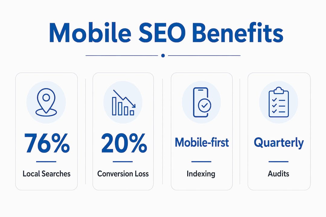
Page speed compounds the problem. A one-second delay in mobile load time can reduce conversions by up to 20%. That is not a marginal loss. For a business generating $50,000 per month in online revenue, a single second of lag could cost $10,000 monthly. Google also measures Core Web Vitals, its set of performance metrics covering load speed, interactivity, and visual stability, on the mobile version of your site. Poor scores directly suppress your search visibility.
Pro Tip: Use Google Search Console’s Mobile Usability report alongside PageSpeed Insights to identify exactly which pages fail mobile performance thresholds. Fix the highest-traffic pages first.
What content parity means in practice
Content parity means every piece of text, every image, and every structured data element visible on your desktop site must also be accessible on mobile. A common mistake is placing key testimonials or FAQs in desktop-only sidebar widgets. Those elements vanish on mobile, and so does their SEO value. Audit your site by loading each key page on a real smartphone, not just a browser emulator, and confirm that nothing critical is hidden.
| Mobile SEO Factor | Why It Matters |
|---|---|
| Mobile-first indexing | Google ranks your site based on its mobile version |
| Content parity | Hidden mobile content loses ranking weight |
| Page load speed | Each second of delay cuts conversions by up to 20% |
| Core Web Vitals | Performance scores measured on mobile affect search position |
| Structured data | Must appear on mobile to influence rich results |
What are the best practices for mobile optimization?
Mobile optimization covers speed, interaction design, and content prioritization, not just resizing a desktop layout to fit a smaller screen. The distinction matters because businesses that only install a responsive theme often stop there. True mobile optimization requires deliberate decisions about what users see, how fast they see it, and how easily they can act on it.

Speed optimization techniques that actually work
Page weight is the fastest lever you can pull. Compress images using formats like WebP, which delivers smaller file sizes than JPEG without visible quality loss. Eliminate render-blocking JavaScript by deferring scripts that are not needed for the initial page load. Use a content delivery network, or CDN, to serve assets from servers geographically close to your visitors. Fast mobile site speed is both a ranking factor and a direct conversion driver, so every millisecond you shave off load time has a measurable return.
Design principles that keep mobile users engaged
- Thumb-friendly tap targets: Buttons and links should be at least 48 pixels tall and wide so users can tap them without frustration on any screen size.
- Prioritized content: Place your most important headline, offer, or call to action in the top portion of the screen so users see it without scrolling.
- Simple navigation: Replace complex dropdown menus with a hamburger menu or a sticky bottom navigation bar. Fewer taps mean fewer drop-offs.
- Readable typography: Use a minimum font size of 16 pixels for body text. Pinch-to-zoom is a signal of poor design, not user preference.
- Minimal form fields: Every extra field on a mobile form reduces completion rates. Ask only for what you need.
Pro Tip: Test your site on actual Android and iOS devices at different network speeds, not just on Wi-Fi. Many of your customers browse on 4G or slower connections, and that gap reveals performance problems that lab tests miss.
Mobile-first design forces content prioritization, which produces cleaner, faster experiences across all devices. When you design for the smallest screen first, you strip away everything that does not serve the user. The result is a leaner site that loads faster even on desktop. This is why mobile-first is a philosophy, not just a screen size setting.
What are the real business benefits of mobile-friendly design?
The benefits of mobile-friendly design translate directly into revenue. 76% of local mobile searches result in a store visit within 24 hours. For any business with a physical location, that statistic reframes mobile optimization as a foot-traffic driver, not just a digital metric. A restaurant, a law firm, or a retail shop that ranks well for local mobile searches captures customers who are ready to act right now.
Local search behavior reinforces this point. Local mobile queries frequently include “near me” or “open now” terms, and those searches convert to real-world visits faster than almost any other search type. If your site loads slowly or displays poorly on a phone, you lose that customer to a competitor whose site is ready for them.
Beyond local search, mobile optimization produces these measurable business outcomes:
- Lower bounce rates: Users who can read and navigate your site easily stay longer and view more pages.
- Higher repeat visit rates: 88% of users are less likely to return after a poor mobile experience. A well-optimized site earns return visits.
- Stronger brand perception: A polished mobile experience signals professionalism and builds trust before a customer ever contacts you.
- Competitive differentiation: Many small and mid-sized businesses still have poorly optimized mobile sites. A fast, clean mobile experience sets you apart in local search results.
Mobile optimization also extends to customer touchpoints beyond the website itself, including SMS campaigns, mobile email design, and AI-driven personalization. Businesses that connect these channels create a consistent experience that reinforces their brand at every interaction.
What are the most common mobile optimization mistakes?
The most damaging mistake is treating mobile as a secondary concern. A desktop-first mindset produces sites where mobile is an afterthought, and that approach leads directly to hidden content and poor user experience that harms both rankings and conversions. Recognizing the specific pitfalls helps you avoid them before they cost you traffic.
-
Ignoring content parity. Businesses frequently hide essential information behind accordions or tabs that Google’s crawler may not fully index on mobile. Every key piece of content must be visible and crawlable on the mobile version.
-
Overloading page weight. Uncompressed images and third-party scripts are the most common causes of slow mobile load times. Audit your page weight monthly using tools like Google PageSpeed Insights or GTmetrix.
-
Complicated navigation structures. Multi-level dropdown menus that work on desktop become unusable on a touchscreen. Simplify your navigation to three to five top-level options with clear labels.
-
Neglecting mobile-specific UX elements. Pop-ups that cover the full screen on mobile, tiny close buttons, and auto-playing video with sound all drive users away. Google also penalizes intrusive interstitials on mobile pages.
-
Skipping ongoing testing. Mobile technology changes fast. A site that passed a mobile audit in 2024 may fail new Core Web Vitals thresholds in 2026. Schedule quarterly mobile audits as a standard part of your marketing calendar.
Businesses also underestimate mobile-centric customer support. If a user on a phone cannot easily find your phone number, chat widget, or contact form, they leave. Mobile optimization as a full strategy means every customer touchpoint, from the homepage to the support page, works without friction on a small screen. You can learn more about mobile responsiveness best practices to audit your current setup against current standards.
Key Takeaways
Mobile optimization is the foundation of search visibility and user engagement because Google ranks sites based on their mobile version, and most web traffic now arrives from smartphones.
| Point | Details |
|---|---|
| Mobile-first indexing | Google uses your mobile site to determine rankings, making mobile parity non-negotiable. |
| Speed drives conversions | A one-second load delay cuts conversions by up to 20%, so page speed is a revenue issue. |
| Local search impact | 76% of local mobile searches lead to a store visit within 24 hours, directly driving foot traffic. |
| Content visibility | Hidden or collapsed mobile content loses SEO weight and must be made fully accessible. |
| Ongoing audits | Mobile standards evolve with Core Web Vitals updates, requiring quarterly performance reviews. |
Mobile-first is not a trend. It is the baseline.
Working with business owners across New Jersey and beyond, I have watched the same pattern repeat itself. A company invests in a beautiful desktop website, sees decent traffic for a year, then watches rankings slip without understanding why. When we audit the site, the mobile version is slow, the navigation is broken on smaller screens, and key content is buried behind elements that Google cannot read. The fix is never one thing. It is a series of deliberate decisions that should have been made from the start.
What I tell every client is this: your mobile site is your website now. The desktop version is the secondary experience. If you build and test for mobile first, the desktop version almost always benefits too. The reverse is rarely true. I have also seen businesses make the mistake of treating a responsive theme as the finish line. Responsive design is the starting point, not the destination. Speed, content structure, navigation, and local search signals all require separate attention.
The businesses I have seen grow fastest in organic search are the ones that treat mobile optimization as a living process, not a one-time project. They test, they measure, they adapt. That mindset is what separates the brands that ride the waves of algorithm updates from the ones that get caught off guard by them. If you want to understand the full scope of what mobile search demands, the 2026 mobile SEO guide we put together covers the technical and strategic layers in detail.
— Big
How Bigfinseo can help you get mobile optimization right
Getting mobile optimization right requires more than a checklist. It requires technical expertise, design judgment, and an understanding of how Google’s algorithms reward well-built mobile experiences.

Bigfinseo works with business owners and marketers across New Jersey and nationally to build and refine websites that perform on every device. From mobile-first web development to full SEO strategy, our team handles the technical and creative work so you can focus on running your business. If you are starting from scratch or auditing an existing site, our SEO for beginners resource is a practical first step toward understanding what your site needs to compete. We are ready to help you chart a course toward stronger rankings and better results.
FAQ
What is mobile optimization in simple terms?
Mobile optimization is the process of designing and configuring a website so it loads fast, displays correctly, and is easy to use on smartphones and tablets. It covers speed, navigation, content layout, and visual design.
Why does mobile optimization matter for SEO?
Google uses mobile-first indexing, meaning it ranks your site based on its mobile version. A slow or incomplete mobile site directly lowers your search rankings, regardless of how well your desktop site performs.
How does mobile speed affect conversions?
A one-second delay in mobile page load time reduces conversions by up to 20%. Faster sites keep users engaged and make it easier for them to complete purchases, form submissions, or calls.
What is the difference between responsive design and mobile optimization?
Responsive design automatically adjusts a site’s layout to fit different screen sizes. Mobile optimization goes further by addressing load speed, content prioritization, thumb-friendly navigation, and mobile-specific user behavior. Responsive design is one component of a complete mobile strategy.
How often should I audit my mobile site?
Quarterly audits are the standard. Google updates its Core Web Vitals thresholds and ranking criteria regularly, and your site’s performance can change as you add new content, plugins, or third-party scripts. Use on-page optimization checks alongside mobile-specific tools to stay current.

Michael Fleischner is a marketing strategist, entrepreneur, author, and TEDx speaker with more than 20 years of experience helping businesses grow. As Founder and CEO of Big Fin SEO, he advises small and midsize businesses on marketing strategy, SEO, paid advertising, customer acquisition, and Generative Engine Optimization (GEO).
Michael works directly with business owners and leadership teams through half-day marketing strategy intensives, full-day workshops, and ongoing strategic advisory engagements, including fractional CMO support.
He is the author of SEO Made Simple and The 7 Figure Freelancer, and has served in national leadership roles with the American Marketing Association.
Learn more about Michael at https://michaelfleischnermedia.com or explore his marketing strategy services at https://bigfinseo.com/marketing-strategy/.



 Corine Rigby
 Laura Ayres
 Michael Fleischner