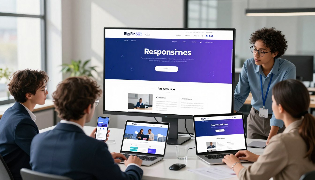
Your website is the main way people see your brand online. To stand out, it’s not just about looking good. It’s about how well it works on phones and tablets.
If your site doesn’t work well on mobile, you miss out on a big part of your audience.
Mobile responsiveness is key for businesses today. Working with experts at https://geo.bigfinseo.com can make your online presence strong. They help you make your site fast, easy to use, and effective.
This guide will show you how to excel on the mobile web. Let us help you make your website a growth engine.
- Prioritize a mobile-first strategy to capture modern consumer attention.
- Understand that seamless cross-device performance is essential for market authority.
- Leverage expert partnerships to optimize your site for long-term success.
The Current State of Mobile Responsiveness
The digital world has changed, making mobile responsiveness key to your online success. Most of the world’s traffic comes from mobile devices. If your site isn’t mobile-friendly, you miss out on a big part of your audience.
Why Mobile-First Indexing Still Dominates
Search engines now focus on mobile versions of websites first. This means your mobile site is more important than your desktop site for search rankings. Your desktop site is no longer the main focus for search visibility.
Ignoring this is a big mistake that hurts your online presence. We tell our partners to make their mobile site the main version of their brand. A strong mobile site means you meet the search engine’s standards for today’s search results.
The Impact of Mobile User Experience on SEO Rankings
A good mobile experience turns visitors into loyal customers. If a site is hard to use on a phone, users leave fast. This high bounce rate tells search engines your site is not good, hurting your SEO rankings.
As shown by experts at https://geo.bigfinseo.com, not optimizing for mobile hurts your market standing. We see mobile optimization as essential for technical excellence. A smooth, easy-to-use site attracts serious visitors and keeps you at the top of your field.
Core Principles of Mobile Responsiveness
We start with a mobile-first mindset for digital dominance. This means your site’s structure is built for the smallest screens first. This way, your main content is always the focus for visitors.
This approach avoids the common problem of desktop sites being too big for mobile. It keeps your site clean and easy to use.
Defining the Mobile-First Design Philosophy
A mobile-first design sees the smartphone as the main place for your brand. We remove extra stuff to focus on speed and easy navigation. This makes us choose what content really matters to your audience.
Building for mobile makes your site better for desktop users too. At https://geo.bigfinseo.com, we say this isn’t just a trend. It’s essential for success in today’s search engines. Starting with small screens makes your site stronger.
Fluid Layouts Versus Adaptive Design
Deciding between fluid layouts and adaptive design is key. Fluid layouts use percentages for smooth resizing. This works well across many screen sizes.
Adaptive design uses fixed sizes for layouts. It gives more control but needs more updates for new devices. We help pick the best choice for your business and tech needs.
Media Queries and Breakpoint Management
Media queries are like the backbone of your site. They let your site change styles based on device size. Without them, your site would look bad on small screens.
Good breakpoint management means your design changes at the right times. We pick these points for a good look and fast performance. This makes sure your site works well on any device.
Implementing Fluid Grids and Flexible Images
Mastering fluid layouts is key for brands that value visual quality. We make sure your online presence is strong by creating flexible structures. These adapt to any screen size. At https://geo.bigfinseo.com, we offer solutions to keep your brand looking great everywhere.
Scaling Assets Without Losing Quality
Visuals must stay sharp, no matter the device. We use CSS max-width properties to keep images in check. This way, your brand’s images stay professional on all screens.
Using Modern CSS Units for Responsive Typography
Clear text is crucial in today’s digital world. We switch to relative units like rem and viewport width for responsive text. This makes your text scale well, keeping your message clear on all devices.
Handling High-Resolution Displays and Retina Screens
High-quality experiences are essential in today’s market. We use high-resolution assets and vector graphics for sharp retina screens. This ensures every visitor sees your brand in the best light.
Optimizing Touch Targets and Navigation
Understanding how people use their phones is key. We make sure your site is easy to use and feels natural. This helps keep users on your site longer.
Designing for Thumb-Friendly Interaction
Most people use their thumbs to navigate phones. If your buttons are too small or hard to reach, it’s frustrating. We make sure all buttons are big enough and easy to use.
We follow a rule of at least 44 by 44 pixels for buttons. This makes it easy for everyone to use your site without mistakes. We also put buttons in the “thumb zone” for better comfort and speed.
Simplifying Menus for Small Screens
Too many menu options can hurt mobile use. We suggest simple, easy-to-use menus that show only the most important stuff. This helps visitors find what they need quickly.
- Implement clear, high-contrast icons for navigation.
- Use sticky headers to keep essential links accessible.
- Limit menu items to the most critical business objectives.
Reducing Input Friction in Mobile Forms
Long forms can scare off mobile users. We make forms easier by using smart defaults and fewer fields. Each field you remove makes it more likely someone will finish the form.
We suggest using specific types, like numeric keypads for phone numbers, to make filling out forms faster. This makes your site easy to use and keeps visitors coming back.
Performance Metrics and Core Web Vitals
Search engines now focus on your site’s technical health. They use Core Web Vitals to check how fast and stable your site is. For top SEO rankings, knowing these technical needs is key, as shown at https://geo.bigfinseo.com.
Understanding Largest Contentful Paint on Mobile
Largest Contentful Paint shows how fast the main content of a page loads. On mobile, it’s often the hero image or headline. If it takes too long, users might leave before it loads.
To get a better score, focus on loading what’s above the fold first. Make your code faster and servers quicker. This way, your site gives value right away to every visitor.
Minimizing Cumulative Layout Shift During Loading
Cumulative Layout Shift checks how much elements move while loading. A moving button can be very annoying. This can hurt your site’s performance and lower engagement.
“Stability is the hallmark of a professional interface; when elements shift unexpectedly, you lose the trust of your audience.”
To stop elements from moving, always set width and height for images and videos. This keeps the space needed on the screen, making loading smooth and predictable.
Leveraging Browser Caching and Image Compression
Browser caching and image compression boost your site’s speed. Caching stores static files locally, cutting down on server requests. Compressing images keeps quality high without slowing down your site.
- Implement aggressive browser caching policies for static assets.
- Use modern file formats like WebP to reduce image weight.
- Minify CSS and JavaScript files to strip away unnecessary data.
- Utilize Content Delivery Networks to serve content closer to the user.
By focusing on these technical areas, you strengthen your site. Keeping Cumulative Layout Shift low and Largest Contentful Paint fast will help you stay on top in search rankings.
Advanced Mobile Responsiveness Techniques
We use the latest tech to improve mobile performance. We go beyond simple templates to create sites that respond perfectly to user actions. This keeps your brand strong on all devices.
Utilizing CSS Grid and Flexbox for Complex Layouts
Modern sites need strong, flexible layouts. We use CSS Grid and Flexbox to create complex, multi-dimensional designs. These tools help us manage layout and spacing easily.
These tools give us the freedom to create high-end designs. We move away from old, rigid structures that don’t work on small screens. Instead, we focus on fluid systems that enhance visual appeal and user interaction.
Implementing Progressive Web App Features
We use Progressive Web App (PWA) features to engage mobile users. PWAs offer a smooth, app-like experience right in the browser. They make your site fast and reliable.
- Offline access for key content.
- Fast loading with service workers.
- Push notifications for keeping users engaged.
- Easy installation on home screens for more visibility.
By focusing on PWAs, we make sure your site is always quick and dependable. This approach keeps users interested, no matter their internet connection.
Conditional Loading for Resource-Heavy Elements
Managing resources well is key to a fast site. We use conditional loading to delay loading of big files like videos or animations. This saves data and keeps pages loading fast.
We load important content first. Using CSS Grid helps keep the layout stable while other assets load. This way, your site looks great and works efficiently.
Testing Strategies for Diverse Devices
To be a leader online, you need a strong testing plan. Your site must work well on all modern mobile devices. At https://geo.bigfinseo.com, we guide you to make sure your site is ready for any user.
Automated Testing Tools for Cross-Browser Compatibility
Automated tools are fast for checking your site on different systems and sizes. They’re key for keeping your site working the same on all browsers. By using these tools, you find and fix problems before users see them.
Real-World Device Testing Versus Emulators
Emulators are quick but can’t match real devices. We suggest using both virtual tests and real devices. This way, you check how things like touch and battery work.
Testing only on software can miss bugs that show up on real phones. Testing on actual devices ensures a smooth experience for everyone. This focus on quality sets leaders apart.
Analyzing User Behavior Through Heatmaps
Understanding how users act is key to a good mobile plan. Heatmaps show how people use your site. They help find problems that other tools might miss.
We use this info to make your site better. Knowing how users move through your site helps us make it more effective. When you know your data, you know your market.
Common Pitfalls to Avoid in 2024
To be a top mobile site, you must dodge common pitfalls in 2024. We spot the technical traps that can harm your strategy and brand. Stay alert to keep your online presence strong and easy to use.

Overlooking Horizontal Scrolling Issues
Horizontal scrolling is a big problem for mobile users. It makes them scroll sideways, which messes up content flow and is annoying. Make sure your site looks good on all screen sizes to avoid this.
- Use relative units like percentages instead of fixed pixel widths.
- Implement CSS overflow-x: hidden to prevent accidental layout shifts.
- Test on multiple devices to catch unexpected overflow issues early.
Ignoring Accessibility Standards on Mobile
Ignoring accessibility standards is a big mistake. It blocks your audience and can lead to legal issues. As experts at https://geo.bigfinseo.com say, making your site accessible is key for growth.
To make your mobile site accessible, follow these tips:
- Maintain high color contrast ratios for text and background elements.
- Provide clear, descriptive labels for all interactive touch targets.
- Ensure screen readers can navigate your mobile menu structure effectively.
Neglecting Third-Party Script Performance
Third-party scripts can slow down your site. While they’re useful, they can cause problems if not managed well. Regularly check your scripts to keep your site fast.
To keep your site running smoothly, take these steps:
- Defer non-essential scripts to load after the main content appears.
- Limit the number of external plugins running on your mobile pages.
- Monitor load times to ensure accessibility standards are not compromised by heavy scripts.
Conclusion
Mobile responsiveness is key to your digital success. Your website is the main way people see your brand. It needs to be fast, clear, and easy to use.
Technical skill gives you an edge. Working with https://geo.bigfinseo.com helps you lead your industry. Our team knows how to handle today’s web standards.
Use these tips to make your business mobile-friendly. Staying up-to-date keeps your brand ahead in the digital world. Start improving your online presence now for future growth.
FAQ
Why is Google’s mobile-first indexing critical for our brand’s digital dominance in 2024?
Mobile-first indexing is key for online success. Google now uses the mobile version of websites for indexing and ranking. If you don’t optimize for mobile, you lose your online authority.
At Bigfin, we make sure your site meets these strict search engine standards. This keeps you at the top of search results.
What is the primary difference between fluid layouts and adaptive design for professional websites?
Fluid layouts adjust to any screen size, from small phones to big desktops. They use percentages for smooth transitions. Adaptive design, on the other hand, has fixed sizes for specific devices.
For a strong, future-proof site, we use fluid grids at Bigfinseo.com. This keeps your brand’s look consistent across all devices.
How do Largest Contentful Paint (LCP) and Cumulative Layout Shift (CLS) affect our SEO rankings?
LCP and CLS are key for digital success. LCP checks how fast your main content loads on mobile. CLS looks at how stable your content is during loading.
If your content moves around, it hurts user trust and search engine rankings. At Bigfin, we optimize these areas for top performance.
Can we achieve high-fidelity visuals on Retina displays without compromising mobile load speeds?
Yes, we can. We use advanced image compression and formats like WebP. This keeps images sharp on Retina displays without slowing down your site.
Our team at Bigfin uses modern CSS and responsive images. This ensures a high-quality experience that loads fast on any mobile network.
What are the strategic benefits of implementing Progressive Web App (PWA) features?
PWAs make your site feel like a native app. They offer offline access and push notifications. This turns your site into a powerful tool for engaging with users.
At Bigfinseo.com, we make your site a high-performance tool. It grabs attention and boosts conversions.
Why is real-world device testing superior to using software emulators?
Emulators are just a start. They can’t match the real feel of using a device. Real-world testing finds issues that emulators miss.
We test your site on real devices. This makes sure it works perfectly when users interact with it.
How does reducing input friction in mobile forms impact our conversion rates?
Mobile users want quick, easy experiences. We simplify forms and use HTML5 to make typing easier. This makes your site more user-friendly.
At Bigfin, we focus on making your mobile forms easy to use. This boosts your lead generation and sales.
What are the hidden dangers of neglecting mobile accessibility standards like WCAG?
Ignoring accessibility is a big mistake. It can harm your brand’s reputation and lead to legal issues. We make sure your site is easy to use on mobile.
We optimize touch targets and ensure screen reader compatibility. This shows your brand is responsible and authoritative.
Michael Fleischner is the founder of Big Fin SEO, a New Jersey-based local SEO agency helping service-area and multi-location businesses increase visibility, generate qualified leads, and drive measurable revenue from search.
He is a TEDx speaker, Amazon-published author of The 7 Figure Freelancer, and a frequent speaker on SEO, AI-driven marketing, and personal branding.


 Corine R.
 Laura A.